Code behind “A Visual History of the Tour de France”
Code in support of my article (which charts the past century of Tour de France races) can be found on my GitHub.
The code snippets below show how I built some of the charts in my article.
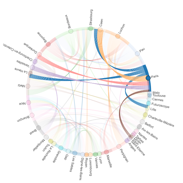
Chord chart
Takes in a links dataframe (with columns for source and target position, and a value column to use for line weights) and a nodes dataframe (with columns for index for city position name and city with the name of the city).
import holoviews as hv
from holoviews import opts, dim

hv.extension('bokeh')
hv.output(size=200)

chord = hv.Chord((links_tdf
                  , nodes_tdf))
chord.opts(
    opts.Chord(cmap='Category20', edge_cmap='Category20', edge_color=dim('source').str(),
               labels='city', node_color=dim('index').str()))
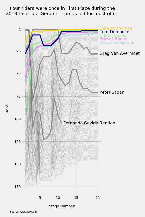
Bump chart
Takes a dataframe with columns for stage_num, ranking, and rider (for the rider’s name).
plt.style.use('fivethirtyeight')
fig = plt.figure(figsize=(8,12))
ax = fig.add_subplot(111)
plt.gcf().subplots_adjust(top=0.9, bottom=0.10, left=0.15, right=0.70)

data = rankings_2018.copy()

for rider in list(data.rider.unique()):
    d = data[data.rider == rider]
    d = d[['stage_num','ranking']]

    if rider == 'GERAINT THOMAS':
        ax.plot(d.stage_num, d.ranking, color='gold', alpha=1.0, zorder=10)
        plt.text(d.stage_num.max()+0.5, d.ranking.tail(1),rider.title(), size=16, color='gold')
    elif rider == 'TOM DUMOULIN':
        ax.plot(d.stage_num, d.ranking, color='darkblue', alpha=1.0, zorder=9)
        plt.text(d.stage_num.max()+0.5, d.ranking.tail(1)+3,rider.title(), size=16, color='darkblue')
    elif rider == 'CHRIS FROOME':
        ax.plot(d.stage_num, d.ranking, color='lightgreen', alpha=1.0)
        plt.text(d.stage_num.max()+0.5, d.ranking.tail(1)+6,rider.title(), size=16, color='lightgreen')
    elif rider == 'PRIMOŽ ROGLIC':
        ax.plot(d.stage_num, d.ranking, color='violet', alpha=1.0)
        plt.text(d.stage_num.max()+0.5, d.ranking.tail(1)+9,rider.title(), size=16, color='violet')
    elif rider == 'STEVEN KRUIJSWIJK':
        ax.plot(d.stage_num, d.ranking, color='lightblue', alpha=1.0)
        plt.text(d.stage_num.max()+0.5, d.ranking.tail(1)+12,rider.title(), size=16, color='lightblue')
    elif rider in ['GREG VAN AVERMAET', 'PETER SAGAN', 'FERNANDO GAVIRIA RENDON']:
        ax.plot(d.stage_num, d.ranking, color='black', alpha=0.4)
        plt.text(d.stage_num.tail(1)+0.5, d.ranking.tail(1)+1,rider.title(), size=16, color='black')
    else:
        ax.plot(d.stage_num, d.ranking, color='grey', alpha=0.2, linewidth=1.5)

plt.gca().invert_yaxis()
ax.set_title('\n Four riders were once in First Place during the\n 2018 race, but Geraint Thomas led for most of it. \n'
             , size=18)
ax.set_ylabel('\n Rank \n', size=14)
ax.set_xlabel('\n Stage Number \n', size=14)
ax.set_xticks([5,10,15,21])
ax.set_yticks([1,25,50,75,100,125,150,175])
plt.annotate('\n Source: www.letour.fr \n', (0,0), (-50, -50), xycoords='axes fraction',
             textcoords='offset points', va='top', size=10)
plt.savefig(os.getcwd() + '/img/02_rankings_2018.png')
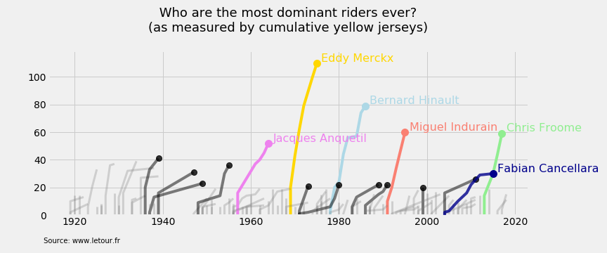
“Sumo” chart
Inspired by the delightful charts from FiveThirtyEight’s project on sumo wrestling.
Takes a dataframe with columns for year, cum_yellows (for cumulative yellow jersey counts) and rider (for the rider’s name).
plt.style.use('fivethirtyeight')
fig = plt.figure(figsize=(12,5))
ax = fig.add_subplot(111)
plt.gcf().subplots_adjust(top=0.8, bottom=0.15, right=0.87)

data = yellows_over_time.copy()

for rider in list(data.rider.unique()):
    d = data[data.rider == rider]
    first_row = pd.DataFrame([{'rider':None, 'year':None, 'cum_yellows':0}])
    d = pd.concat([first_row, d], sort=False).fillna(method='bfill')
    final_year = d.tail(1)

    if rider == 'EDDY MERCKX':
        ax.plot(d.year, d.cum_yellows, color='gold', alpha=1.0)
        plt.text(d.year.max()+1, d.cum_yellows.max()+1,rider.title(), size=16, color='gold')
        plt.plot(final_year.year, final_year.cum_yellows, marker='o', markersize=10, color='gold')
    elif rider == 'BERNARD HINAULT':
        ax.plot(d.year, d.cum_yellows, color='lightblue', alpha=1.0)
        plt.text(d.year.max()+1, d.cum_yellows.max()+1.5,rider.title(), size=16, color='lightblue')
        plt.plot(final_year.year, final_year.cum_yellows, marker='o', markersize=10, color='lightblue')
    elif rider == 'MIGUEL INDURAIN':
        ax.plot(d.year, d.cum_yellows, color='salmon', alpha=1.0)
        plt.text(d.year.max()+1, d.cum_yellows.max()+1,rider.title(), size=16, color='salmon')
        plt.plot(final_year.year, final_year.cum_yellows, marker='o', markersize=10, color='salmon')
    elif rider == 'CHRIS FROOME':
        ax.plot(d.year, d.cum_yellows, color='lightgreen', alpha=1.0)
        plt.text(d.year.max()+1, d.cum_yellows.max()+1.5,rider.title(), size=16, color='lightgreen')
        plt.plot(final_year.year, final_year.cum_yellows, marker='o', markersize=10, color='lightgreen')
    elif rider == 'JACQUES ANQUETIL':
        ax.plot(d.year, d.cum_yellows, color='violet', alpha=1.0)
        plt.text(d.year.max()+1, d.cum_yellows.max()+1,rider.title(), size=16, color='violet')
        plt.plot(final_year.year, final_year.cum_yellows, marker='o', markersize=10, color='violet')
    elif rider == 'FABIAN CANCELLARA':
        ax.plot(d.year, d.cum_yellows, color='darkblue', alpha=0.8, zorder=10)
        plt.text(d.year.max()+1, d.cum_yellows.max()+1,rider.title(), size=16, color='darkblue')
        plt.plot(final_year.year, final_year.cum_yellows, marker='o', markersize=10, color='darkblue')
    elif rider in ['LOUISON BOBET','RENÉ VIETTO','FABIAN CANCELLARA','THOMAS VOECKLER','GINO BARTALI','JOOP ZOETEMELK',
                   'GREG LEMOND','LAURENT FIGNON','LUIS OCANA','SYLVÈRE MAES','JAAN KIRSIPUU']:
        ax.plot(d.year, d.cum_yellows, color='black', alpha=0.5)
        plt.plot(final_year.year, final_year.cum_yellows, marker='o', markersize=8, color='black', alpha=0.8)
    else:
        ax.plot(d.year, d.cum_yellows, color='grey', alpha=0.3, linewidth=3)

plt.title('\n Who are the most dominant riders ever? \n(as measured by cumulative yellow jerseys)\n'
          , size=18)
plt.ylim(0,119)
plt.annotate('\n Source: www.letour.fr \n', (0,0), (-10, -20), xycoords='axes fraction',
             textcoords='offset points', va='top', size=10)
plt.savefig(os.getcwd() + '/img/01_cumulative_yellow_jerseys_over_time.png')
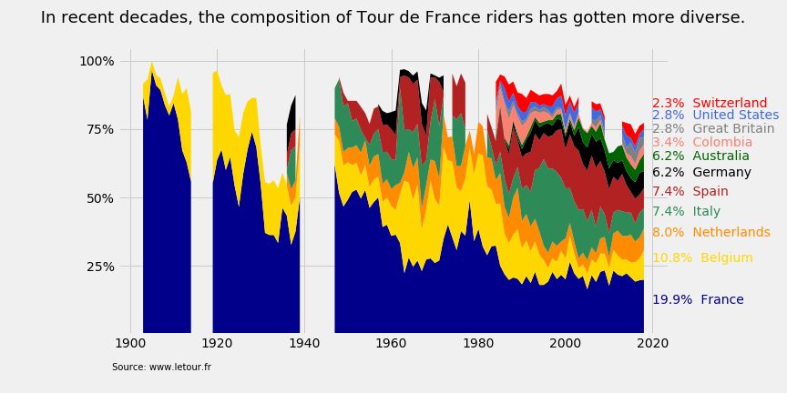
Percentage stacked area chart
Takes an array with years, a 2d array of countries and nat_pct (the percentage of riders in a given year’s race from each country).
plt.style.use('fivethirtyeight')
fig = plt.figure(figsize=(12,6))
ax = fig.add_subplot(111)
plt.subplots_adjust(bottom=0.15, left=0.15, right=0.85)

years = np.array(pivoted_df.columns)
countries = np.array(pivoted_df.loc[co_list].sort_values(2018, ascending=False))

j = 0
for country, info in labels_dict.items():
    if country in ['great britain','united states','switzerland']:
        j += 1
        ax.text(2020, info['ycoord'] + (0.02*j), info['label'], color=info['color'])
    else:
        ax.text(2020, info['ycoord'], info['label'], color=info['color'])

plt.stackplot(years, countries, colors=color_list, labels=labels_dict)
ax.set_yticks([.25,.5,.75,1])
ax.set_yticklabels(['25%','50%','75%','100%'])
ax.set_title('\n In recent decades, the composition of Tour de France riders has gotten more diverse. \n '
             , size=18)
plt.annotate('\n Source: www.letour.fr \n', (0,0), (-10, -20), xycoords='axes fraction',
             textcoords='offset points', va='top', size=10)
plt.savefig(os.getcwd() + '/img/07_nationality_mixture_over_time.png')
plt.show()